


Riso is Magic and Nothing Ever Goes Wrong
a cartooning school field trip

After an unsolicited birthday gift from the universe of covid earlier this month, I got to go on a field trip to a risograph studio and try out riso printing for the first time!
An extremely brief history lesson: risograph technology was invented in post-WWII Japan, using soy-based ink to inexpensively and efficiently print short-run publications such as fliers and posters. In the 1980s, risograph machines became widely available, proliferating in businesses, schools, and churches. As inkjet printers have become more accessible, risograph printing has slowly faded into (relative) obscurity. But if you know where to look, you can still find riso machines (and their devoted acolytes) humming away and printing everything from band posters to limited edition art prints in studios and community centers around the world. One of those places is Directangle Press, in the very quiet town of Bethlehem, New Hampshire.
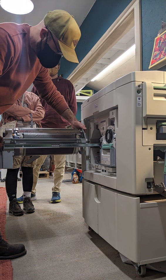
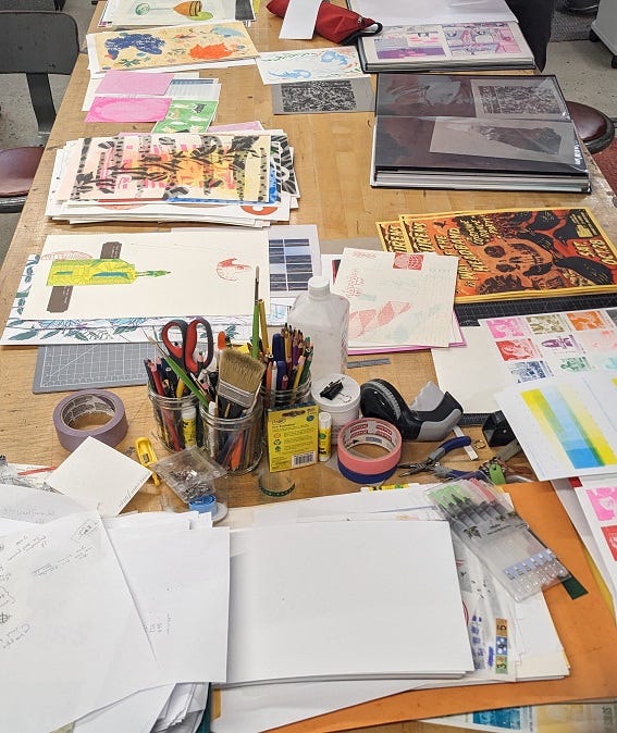
Risograph machines look kind of like a photocopier, but the printing technology they use is more similar to screenprinting.
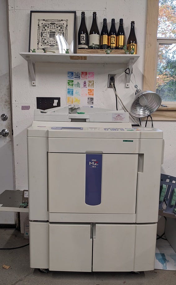
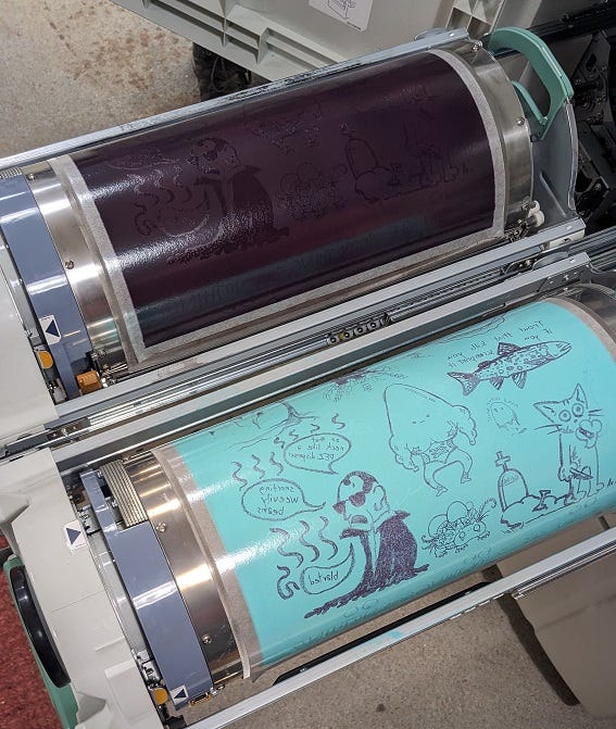
The machine has a flatbed scanner that scans your design and transfers it onto an ink drum as a stencil; the stencil is then rolled across paper to print your image.
The machines at Directangle hold two drums side-by-side and so can print two colors simultaneously — not a universal feature of all risograph machines.
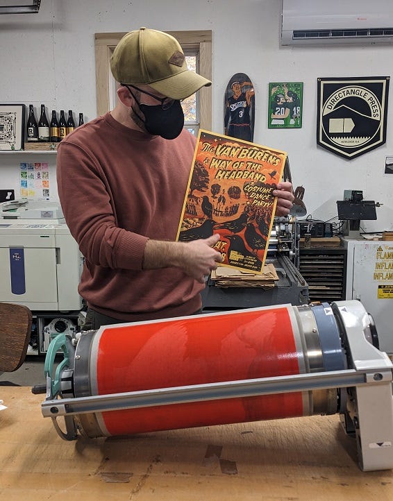
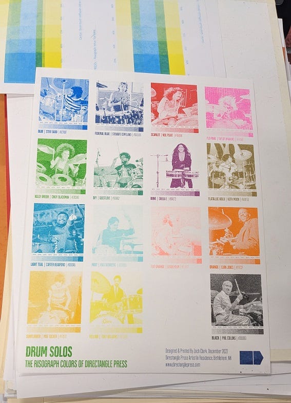
What makes riso so cool, and so popular with a small subset of artists who are nerds about this kind of thing, is that riso’s soy-based inks can achieve some stunning colors that CMYK inkjet printing simply cannot, such as delicious fluorescent pinks and oranges. Each riso studio has a different variety of ink colors available, so hardcore riso fans sometimes travel impressive distances to use the unique inks available at certain studios.
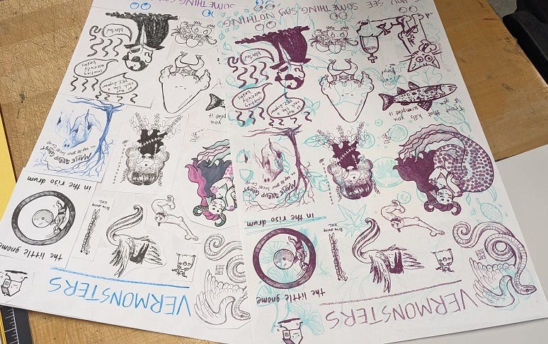
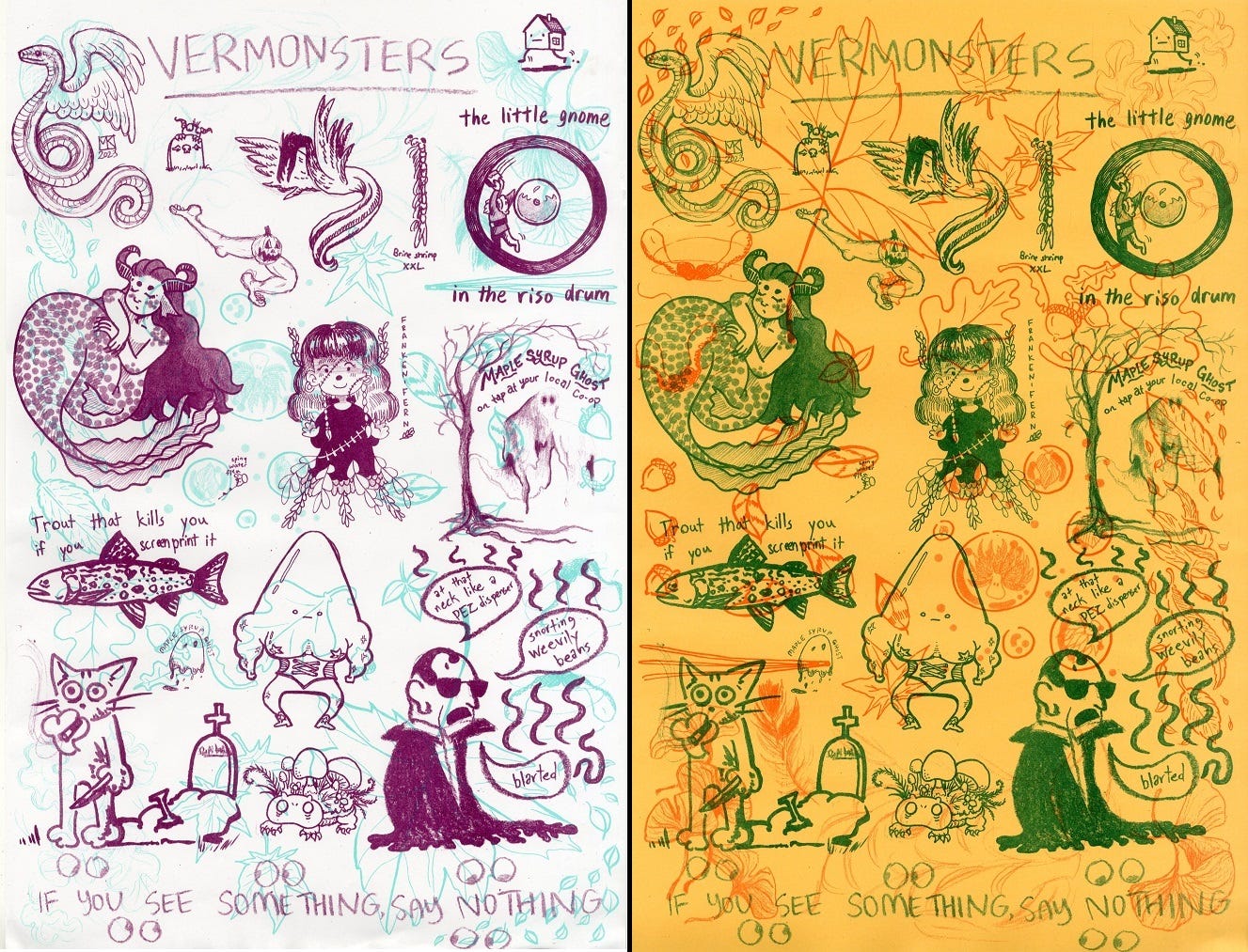
For our printing project, arranged by CCS Fellow and my Weekly Soup Night Co-Chef Shay Mirk, my classmates and I collaborated to create a poster of Vermonsters (that’s a portmanteau of Vermont and monsters, of course!). Each student drew a monster or two, and some autumn ephemera (leaves, acorns, etc.), to create two layers of collaged illustrations, which we printed in two separate dual color combos. Voting on color combos was the fiercest competition I have yet experienced at CCS.
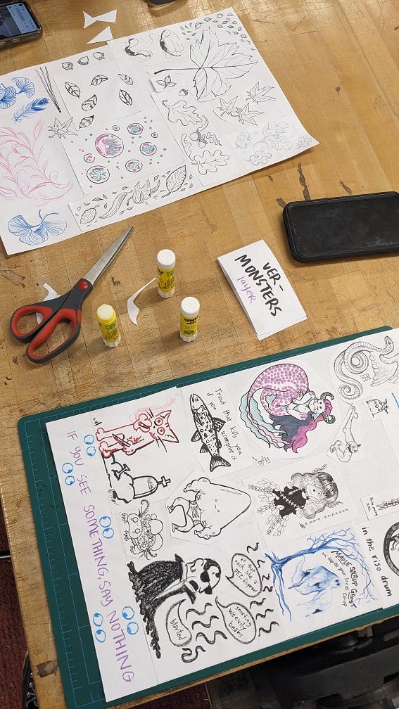
Below is our original collage of monsters next to the printed version on its backdrop of leaves in our first color combination, which was wine and I think seafoam? Maybe it wasn’t called seafoam. Anyway, that light blue-green color that I want to lick for some reason.
Directangle hosts artists-in-residence super often, and we got to look through hundreds of riso prints made and archived in this studio.
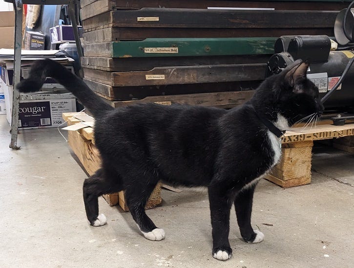
ALSO: THERE IS A SHOP CAT NAMED SCOOP. I’m so sorry, I should have opened with this. But if you read this far, here she is, a treat just for you:
Riso printing involves a lot of trial and error, so it can be a pretty labor-intensive (and paper-intensive) process where lots of things can go wrong in surprising and baffling ways, but that’s honestly… part of the charm of it? I dunno man, artist brains. Why do we like stuff like this. A great unsolvable mystery of the universe.
Are the posters we made kinda odd-looking? Yes. Did we have fun? Yes. Do I want to eat the paper because the colors are just *clenches fist* so good? Unfortunately, also yes.
Here are the finished prints!
Extra credit to anyone who guesses correctly which monsters I contributed. :)
I have no references for names! But I'd guess bottom left and middle right. Very fun!
Did you draw the tombstone gremlin and the spiny water flea?